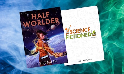
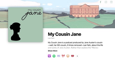
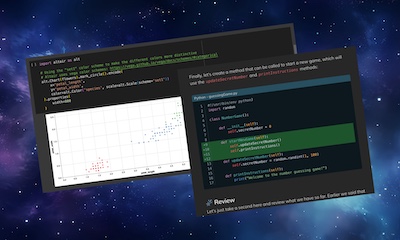
Scientific Software and UI Design
June 27th, 2008A couple of articles came out recently regarding the quality of good UI design and since this is an area that I’m relatively passionate about, I couldn’t resist adding my voice to the mix.
Last year I did a presentation for a course I was taking on the state of user interface design in the realm of scientific software. My study was based on two papers:
Nielsen, J. and Landauer, T. K. 1993. A mathematical model of the finding of usability problems.1
Javahery, H., Seffah, A., and Radhakrishnan, T. 2004. Beyond power: making bioinformatics tools user-centered.2
To start out I asked those present to look at the user interface of a relatively popular and extremely powerful piece of software used for molecular docking. (which shall remain nameless). Those in attendance were relatively familiar with the subject matter that this software dealt with, and at least one was an expert in the field. I asked them how they would go about performing a few relatively simple tasks. No one could figure it out. The controls were non-intuitive and the interface didn’t adhere to any standard UI design principles.
I then showed them the interface to a relatively popular photo management program:

I then asked them how they would go about editing a photo or sending a photo to someone via email. Of course the answers where obvious to everyone. Now is this because the Apple engineers were geniuses and the scientific software developers weren’t? Of course not. You don’t write extremely powerful and useful scientific software by being dumb.
UI Design Research
In their research, Nielsen (considered by many to be the expert in usability testing), and Landauer found that you only need to test your user interface design with 5 users to find over 75% of usability problems. Just 5 users! So if it so easy to find problems in UI design, why do we still have such lousy user interfaces in scientific software? Nielsen and Landauer found that a simple model could quantify the cost to benefits ratio of usability testing. The potential payoffs are substantial:

The model basically figures in two factors:
- The cost of each test user
- The savings to be realized by improved usability (i.e. lower support costs, fewer incremental releases to fix UI problems, etc…)
Unfortunately this model breaks down in the realm of scientific software. Here is my hypothesis as to why that is and why it’s likely to continue if nothing changes:
Lee’s Scientific Software UI Hypothesis
A large portion of scientific tools have poor user interfaces due to a combination of the following factors:
- There is usually no funding for user interface testing.
- Tool-based papers aren’t evaluated for good user interface design during peer review.
- Most people writing these software tools either don’t know what good user interface design looks like or don’t care.
- There are no savings to be gained in improving the user interface.
The fact is that most funding organizations aren’t interested in paying for usability testing. Consequently it doesn’t get done.
Tool based papers (like other scientific papers) are evaluated for merit and accuracy (as they should be). They are not however evaluated based on UI design principles. Changing this alone would stop the deluge of poorly designed user interfaces in scientific software.
(For those of you who aren’t familiar with this process, scientific papers (unlike highly-opinionated blog entries like this one) go through a process called peer-review where they are evaluated for their merit and accuracy. This (usually) helps to filter out work of lesser quality.)
In my experience I have found that there are usually two types of people designing scientific software in the life sciences field. CS grads who have lots of training in designing algorithms but usually no training in UI design, or life scientists who have neither.
This may be an over generalization, but in my experience (and I’m a CS grad), CS grads don’t know how to design good user interfaces. It’s not our fault, these things simply aren’t taught in most CS curriculums. We can optimize O(logn^2) algorithms in our sleep but we often seem to have trouble with basic UI design principles. Either we don’t know about them or we don’t care enough to use them.
This is the big one. There is exactly one payoff for most people in the realm of scientific software (aside from altruistic ones of course), and that is publications. If I publish a paper based on a software tool with a really good and well tested UI design, it counts just as much for me as if I publish a paper based on a software tool designed by a bunch of blind monkeys. (No offense to blind monkeys intended).
Conclusion
So despite the fact that studies (peer reviewed studies mind you) have shown that only a very small number of testers are required to find usability problems, the cost to benefits ratio for scientific tools developers is still unfortunately too high to justify real user interface testing and until that changes we’re going to continue to be stuck with the quality of user interfaces that are currently typical of scientific tools.
- Nielsen, J. and Landauer, T. K. 1993. A mathematical model of the finding of usability problems. In Proceedings of the INTERACT ‘93 and CHI ‘93 Conference on Human Factors in Computing Systems (Amsterdam, The Netherlands, April 24 - 29, 1993). CHI ‘93. ACM, New York, NY, 206-213
- Javahery, H., Seffah, A., and Radhakrishnan, T. 2004. Beyond power: making bioinformatics tools user-centered. Commun. ACM 47, 11 (Nov. 2004), 58-63


